
2004 (Aug-Dec) | 2005 (Jan-May) | 2005 (May-Aug| 2005 (Aug-Dec) | 2006 (Jan-Apr) | 2006 (May-Dec) |2007 (Jan-Aug) | 2007 (Aug-Dec) | 2008 | 2009 | 2010 | 2011-2012 | 2013 | 2014-16 | 2017 | 2018 | 2019
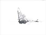
Have been doing drawings. Don't know what to make of them, as most are just ordinary. A log on the beach interests me for its being and not-being.
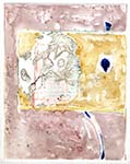
Touched up two computer pieces, Catapault and Primavera.
Just toned down the rock in Catapault; then, messed around with it, making a study for an etching. The etching study is stronger in form, and more edited.
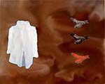
![]() Catapault
Catapault 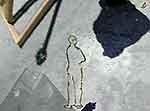
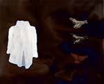
![]() Catapault etching study
Catapault etching study 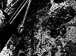
Primavera got a square changed into a circle. The square "spy" picture of the couple had always bothered me, just sticking out too much. As I was looking through the computer works, the solution struck me. Now, the composition works better; as does the statement--analogies having been made.![]()
5/9
![]() Finally got the tire tracks on Transits, thanks to Karin Schminke of Digital Atelier. Put the last two (of the 4 transfers) down out of order because it looked better and it added to both the complesity and the focus (an "X" was formed) at the same time. Rearranged the surface space, taking out the ground for the dog and creating subtle geometric right angle at middle right of tracks area. This was started way before I became interested in blackish ground for my painting. It wouldn't transition well to black dominance, so I'll let it go where it wants, with gentle reining. I might end up with two new things (this work and the black one) to synthesize.
Finally got the tire tracks on Transits, thanks to Karin Schminke of Digital Atelier. Put the last two (of the 4 transfers) down out of order because it looked better and it added to both the complesity and the focus (an "X" was formed) at the same time. Rearranged the surface space, taking out the ground for the dog and creating subtle geometric right angle at middle right of tracks area. This was started way before I became interested in blackish ground for my painting. It wouldn't transition well to black dominance, so I'll let it go where it wants, with gentle reining. I might end up with two new things (this work and the black one) to synthesize.
5/17
It took several layers of varnish to even out the too-different reflections, while still maintaining the three separate white spaces. Spent drying time reorganizing computer prints.
I like the piece. It has an uniqueness and a depth.
5/24
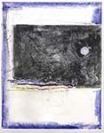
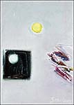
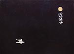 "Nocturne" has gone through several more layers and a coloration of the moon. The difference from the 4/25 stage cannot be seen very well in photographs. It is quite a bit more rich to the human eye, though. A little glazing here and there, and painting the figure should complete it.
 Started a new piece that I thought would pick up where the field left off in "Nocturne," but the brushing and flooding became so interesting, I decided to leave it. There are some strong new currents suggested within. Then it suggested its working title, "Overarching."
Looking up through the sunroof as I was driving home, I thought how my works are related. As objects like trees, wires, birds, clouds flash past, their connections and meanings cannot be corralled. My paintings try to slow down the process.
5/28
Dark thoughts, pleasant, almost susurrating still have my curiosity. Sketches don't relate, at least directly. Perhaps they'll get into the stew somehow.
6/2
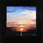
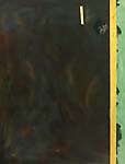
Looking at Seascape (old version), I decided the approach that had worked for Landscape had not worked. Even though I conceived these two as companion pieces, if not a dyptich, the similar broad border areas just didn't work. The apporach of a "pure" light color and an obvious canvas border as the ground, upon which sat the "realistic" painting, created the right tension in Landscape, but was too contrasty in Seascape. Now repainted darker, an encroaching and surrounding darkness is the ground of existence, and the darkness does create the right unity and tension.
6/7
Terrible day, painting. Envisioned a way to make the "secret writing" below the moon in Nocturne look better. It needed to look better even though I had laboriously masked out the writings' strokes many times as I applied multiple layers to the main field. So, that masking back to the white didn't work, and the solution, stroking back into the writing with a light gray leaning into the magenta, didn't either . In fact, when I looked up from the other area I was wrecking to see how the gray had dried, I felt disgusted. Then, I looked back at the foreshortened figure I had been working on, and that looked disgusting too. Maybe sleeping will generate some better painting.
6/15
Mostly getting ready for exhibits. Painting a bit here and there. Although not right yet, "Nocturne" is back on track, with redish caligraphy over the formerly white marks. Perhaps as a result of my cooperation with the Gao Brothers "Field of Vision Beijing."
6/18
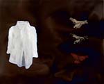
 Twig and remembrance of a shirt I'd sketched many years ago gave me a start on Balance and Imbalance. I think there's something in there, but right now the piece makes me queasy.
6/19
 A photographer friend of mine sent a pic of a lovely Italian hillside. I wanted to reciprocate. Somehow darkness drifted in.
 And I had been thinking while driving that yesterday's piece would look better darker. Also changed the working name from Balance and Imbalance to And Remembrance. These darknesses are not scary. They are also not quite right; but I think wherever it's heading, it's heading.
6/23
I think I'll take a Dremel tool to the mysterious writing on "Nocturne." It will eat back through 5 or so layers of paint, and give the symbols a feeling of age. Also, the writings will then have a texture that strongly contrasts with the field. Painted the field more into the figure, after I re-drew the figure to bring out the foreshortening. That way, he didn't look too much like a Christ figure, but more like the Robin Williams' character in "The Fisher King." "The Fisher King" is a fine response to our era, as I want my work to be.
6/24
From a sketch I'd made, created the computer piece "A Way." Sketch started from a photo I'd made almost 40 years ago, of a table and chair reflected in a mirror. The sketch was conceived with a sliver of wood. When that did't balance out right, made a smudge, first of charcoal, then added pencil. The idea just popped into my head to make this an artwork. Took many hours to get the main field chaotic yet coherent, then to get the elements to work right at a scale twice the size of the original sketch. May turn it into an oil painting. Don't know why this drew me on more so than the previous piece, "And Remembrance." Will finish that soon, also.
7/2
In getting ready for two concurrent exhibits, "Nocturne" and the strokey-thing have been left pretty much alone. The Dremel tool didn't produce the effect I'd wanted, so I've painted and re-painted...and it still doesn't look like writing ancient and yet creative. As a nod to something, I gave the reclining figure a temporary sunburn.
7/3
May have the "writing" the way I like it.Added some lighter bkgrnd color. Not the way I had envisioned it, but it seemed like good art; so I've left it.
_web.jpg) =============>
=============> _web.jpg)
7/7
Reworked the figure in "Nocturne." Technical gem: painting the top of a balding, white-haired head! Little millimeter changes , especially in the left arm and leg, gave the figure a much more believable look, while keeping the floating/lying mystery.
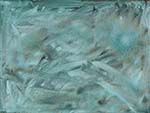
Most importantly, I figured out that I really didn't like the dark works as much as I thought I would. So, what was originally intended as a complementary under-brushing of blue-blue-green (to be multiple-glazed into a darkly transparent hue) for the next in the dark series, I left. Then I glazed yellow and then more blue over it, which, along with some lift-outs and gestures, make the piece springlike, and dynamic....just livelier. Now, the focus is a contrast between the strong arch-like strokes and the "giddy" colors. Feels like a good dormancy, about to bud.
7/10
Average amount of good and bad. The "fresh," blue-green piece of 7/7 struck me today as just too damn pretty. In turning it around, to see if there were other ways, beside the arch and colors, into it--before I worked over the prettiness--I discovered one vertical position that had an edge to it. Painted in the chair and incomplete table from A Way (6/24) near the edge, then glazed a fluctuating complementary over the main field. Table: good. Glaze: bad. Not unfixably bad, however. As for lunch.....Coffee: good. Last of unshelled peanuts: bad.
7/13
Artistic efforts directed towards a poem chapbook being printed by a friend. The original art was a re-working of "Winter Circle," a computer print.
Then I prepared two digital photographs, "Still Life," and "The Morning After It Snowed." Although "works for hire," or "commercial," all of these have my concerns: shimmery reality. Damn the day when fine artists were not allowed to do commercial. It is a division that makes no sense. As a speaker uses language for different purposes, and a good speaker can convey thought and emotion in a broad range of settings, so a good artist should be able to express for ineluctable purposes and also express for the more mundane.
--> 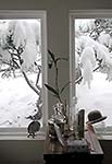 The Morning After It Snowed
7/17
 Nocturne, detail.
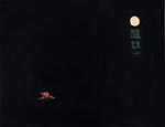
Finished "Nocturne" Most of the work was on the figure, which went more easily than I had expected. Having done the figure many times--from original beach sketch to sketch with head to head studies to transfer sketch to two underpaintings and several background edge corrections--all these absorptions seemed to flow out of the brush, mostly unbidden.
 Pleasure over Nocturne surprises me, as I was getting tired of it; and thought the idea had worn out (7/7). Now, it seems the dark idea is fresh, and the "fresh" piece started on 7/7 was looking so bland that I've gone in another direction. Now an edge along the right side will be important, as will the partial view of table and chair, along with the plain wooden stick, lend a working title of "Peripheries."
7/19
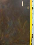
Invited to a friend's studio to do some monoprints. Started with nothing in mind. After improving a bit on the first one, tried to offset print a rusty, old door knob plate. When that didn't work, I sketched it in, and one thing led to another ("Whole Holes 1 Keyhole"). After that, I just went blank, and let the next three develop along whatever path seemed interesting from the ghost image on the plate ("Whole Holes 2 Blue," "Whole Holes 3 Moon," and "Whole Holes 4 Key"). I'm going to let them grow in my head for a while, before I decide to work on any of them or use them, or......
![]()
![]()
![]()
![]()
7/24
Picked and scrapped off all the little brush hairs, deposited when I "final" varnished "Nocturne" by grabbing the wrong brush. Now all I have to do is put on another glaze of color, and re-varnish.
Framed.
Worked on a sketch that interests me. Started out as two ducks, from an artwork in a room where I was going to combine other bits, but got interrupted. Then used the page to demo something via thumbnails. Later, looked at it, and the hand, eye, and brain started to move. I think this, the slowed pace of painting, the productive monoprinting--all hint that I've hit a breathing period, just prior to another climb into new work.
Reading. Terrell is incredible, but it's way too much work for the worth of the idea. Poussin must have felt terribly isolated in his work, caught between Carravagio and LaTour. What clear insight and strong Form.
7/31
Needed a dark companion piece to enter a competition with "Nocturne," so I finished "Balance and Imbalance," changing the name back again from "And Remembrance." (6/19) Hours spent cleaning the edge of the top log so that it floated more, leaving the cutout edge of the middle log, recoloring the bottom log, subtling down the blues in the main field, and blurring and sharpening the shirt until it hovered between clear and ephemeral.
Spent the weekend at Common Bond reunion, where knowledgeable and unsolicited praise for the piece I donated to the silent auction ("Sunset Viscera") made me feel good.
Earlier in the week I laid another glaze on "Nocturne," bringing back up some of the subtle color, and then did a final glaze with a brush that did not shed. (7/24)
Have been asked for the monoprints (7/19) for an exhibition.
8/9
Finished "Three Times." I slept on an unease about so symetrical a piece, but decided to let it go--might be something new creeping in. Perhaps laziness. Even if it is laziness, as more pieces are made, the laziness will become so apparent that even I cannot live with it.
I get a bit of a kick out of the piece. I first think the pleasure is nostalgia; then I think I might be doggedly up to new tricks. I enjoy whipping around the oil sticks. Once again, it takes several reworkings to get it to look and feel spontaneous.
8/14
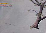
Painted an edge here, varnished there, read, coffeed. Finally got an idea for another small oil, from a piece I was removing from an old frame. That "realistic" work had the tree in the wrong place, so I decided to work with that. Painted over everything but the tree, fixed it up a bit, then painted pure cad yellow, cad red, and ultra blue as marks in upper left, and sgraffitoed a mark mid-lower left. The yellow red blue area started off as loose strokes, trying and erasing several hues until the idea came for the pure and simple marks.
Tree and Real Marks illustration.........
8/16
Tree was too weak. Although that "fit" the idea, it would have been too didactic, and too wrong for the balance of the piece. Perked up the value and color a bit.
Even though I know it, it amazed me how powerful is pure paint (the red, yellow, and blue strokes).
8/18
Finished Tree and Real Marks, oil on board, 10 x 14 in.
Good piece. Composition, idea, color, overall look, fun.
8/26
Storm winds of 106 MPH have focused most efforts away from art. Did see part of an ad, a silkscreen with its stencil and paint on a wall. The face moved me, so decided to scan it, and play with it in a piece. When I inverted it, making it a positive and showing the face, it turned out to be some medieval man! So I went to work on the negative, to make it the vague woman-image I thought I saw, which then looked way too pre-Raphaelite. Inverted it again, to its (altered) negative. Bingo! I think the umber/orange of the "negative" stencil/screen was necessary.
Silkscreen with its stencil and paint 
Have some Zen photos and rolling hills photos from the trip I took with other artists. These, too, I feel will soon come into play.
9/1
For some reason, back in the studio 2 days ago, I got pulled into working on the piece I'd last worked on 7/17. Made the most wonderful yellow stripe, perhaps from looking at Zacharius. It is expressive, random, and ordered (contained)--just luscious. As ideas came into mind, I called the piece "Platform," as in test platform.
Today I beefed up the yellow a bit (more to come, I think), glazed the right side. Before sleeping last night, I pictured some possibilities. Blue looked too ordinary and ugly with the gray underneath. Red, red-purple, and sienna related too much to the other side of the yellow stripe. Yellow would have set up an interesting tension with the stripe, and might be worth a try in a similar situation. Green-yellow, so counter-intuitive, seemed just right. When I started putting it on, I saw that more green was needed, to get the beauty/tension right. Then a cobalt blue glaze on the rest of the piece, after working around the table, chair, and bottle to create a negative (light) outline, and it looked pretty good. Feels like a right path, but I don't know where it's going.
9/4
Cross-currents flowed together. Old computer piece beginning of life segments. Wall crucifix. Stations of the Cross. fade. segments making the "stations" hard to see. Solid ending escaping considerations of crucifixions.
9/8
The painting "Platform" is finished, tentatively. A little more blue to bring what's right of the yellow stripe into the work. Could have "finished" the table and chair more, but that would have taken from it some spirit. I have no idea what it "means," beyond liking the way the wood is in dialog with the paint stroke to its right, the way the chair/table got negativized, and the subtle expression of the yellow stripe. The whole? Maybe it'll come to me later.
9/12
Just did a little touch-up on "Platform." Still don't know if it's a meander or a new path. It has what I'm interested in: the grand and the small, the clean and the painterly, the full and the empty--but it's as if the actors in a play have switched parts.
9/15
Acrylic varnish on last two pieces, before the final MSA varnish. BUT, the surface of "Nocturne" STILL doesn't look right, the acrylic varnish collecting in spots and reflecting light. May have to sand down the surface and do it again, again.
Started to put together a study, based on black curvy-stutter line over raw canvas, raw canvas partial circle-in-square pasted over "moon," and vertically-halved tree--all on a selectively gessoed second print of "Whole Holes 4 Key." (7/19)
Also, in cleaning up, realized I could create a 3 in. deep space black moon from a paint remnant. Sounds good, for some reason.
9/19
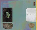
From a newly-taken photo, a paper scrap on my desk, and a spontaneous urge, came the computer piece "Dyad or More."
The ways of looking, being, and becoming emerged from tree hole vs. paper, with the stencil of the face leading to the two rocks as base. The "horizon" at top left just fit into the contrast with the face, and came as an idea after I created the (back)ground.
I especially like the compositional exploration, boldness within a static state.
9/20
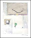
Study: Ties, printing ink, gesso, canvas, acrylic on paper, 10x8 in.
Finished the study begun last week, "Study: Ties." Went mostly as I had envisioned it as I tossed stuff on and gessoed. In finishing, only the balance and fuzzing up the figure/ground relationships changed. The two different types of raw canvas emerged nicely as I added white and gesso around them. The painted stroke, based on the tie, took on a life, going from structural element to feeling part.
.
9/22
Did another study, "Study: Similarities," highlighting a mountain, a leaf, and a blank space. The Cezanne-ish mountain, constructed of accidental strokes, pencil, and white acrylic, is pasted onto a reversed paper over part of a print. The arrangement gives a palimpsest feel.
Started a large painting, based on the raw canvas covering the "sunset" in "Study: Ties." (9/20)
9/27
Worked a bit on the painting. Used the leaf and mountain from "Study Similarities," but the already-existing red-yellow-purple horizontal and nearby raw canvas rectangle made the leaf move down and the mountain left. I like it, but wonder if it's because I've done similar things. So, will go off in new directions with the major field.
10/2
Using the palimpsest idea from"Study Similarities" for the major field. Playing with oil sticks and turp washes as first lay-down. Will use the off-color WN gesso over the top. Masked out the leaf, to preserve the ideas of "real" and how it starts.
10/4
Got the gesso down. Will need to do more, because the subtlety and suggested power are not there. Before the next coat, I decided to flood the main field with a red. This worked out pretty well, although I was wondering as I manipulated the wash why I was doing that since I was going to gesso over it.
Maybe the work on the red wash was because there has to be layers of meaning that are hidden, yet power the statement. So much art today is superficial, with no reference to history (of art or the world), or science, or anything that lasts beyond the lifetime of a human being. If only there were a better balance between the self-aware now and the BIG. The wash is blood, and universe, and accident, and direction. And, somewhat like Rauschenberg's erasing of Dekooning, the gesso will make it all seem less important, even though it is not.
10/10
I’ve been thinking about the palimpsest painting, as I add thin layers of translucent white.
There’s another American artist besides me who wanted to bring together the East and the West. Looking at the Floating World art of Edo Japan, Whistler painted the moment-soon-to-disappear. In that, he influenced T.S. Elliot and Proust. But my beef with him is that he mistook the Eastern sense of the moment, making it too “mystical.” Perhaps that is as close as we can get in the West to that sense. But to Eastern poets and Plains Indians, the ephemeral is not lavender-shrouded twilight moments on the Thames. “This is a good day to die,” uttered by Indians gives a truer feel. The ephemeral moment does not translate into the mysterious. The elevated feeling it brings on is not soft, but more like St. Exupery experience flying over the desert. In an open cockpit, under moonlight, he sees the settlements of man below, the rolling desert to the horizon, feels the noise and vibrations of the wonderful technology that is airplane. It is that solid ephemeral that I try for in my painting. Objects are transiently related, floating in the molecular churning of our universe, but they are unprettified solid.
10/13
My standard special acrylic varnish formulation works perfectly to make the gessoed areas translucent. Not there and deeply there at the same time. Leaf was fixed a bit. Next, will paint my homage to Cezanne, the mountain.
10/14
De-fatted weiner stains on paper towel looked like possibility for a major field in a computer piece. Became familiar with it, trying to get it to scan right. Dropped in a few visual scraps I'd been working on. Too ilustration-like now; but there are forms and emotions I like.
10/20
Planned on burying a dead leaf in the palimpsest painting today. It would go under the collaged piece of canvas, and I'd leave it un-varnished so that it might outgas and affect the surface. Would also look for a lighter weight canvas piece to collage than the current piece. Then an old friend stopped into the post office before I got to the studio, and after we'd finished talking I didn't have time to do the collaging. There is something reflecting the art/life connection in that.
Did start another 3x4 ft. canvas based on the composition on the computer piece (10/14) I've been working on. That piece, now named "Synopsis" has a presence that is both looming yet moving on. I've spent several sessions on it, and it's beginning to have some depth. Creeping back in, a small thing, is the deep gray-green I originally submerged with the stained paper towel. For some unknown reason.
10/21
Synopses archival computer print 12 x 15 in.
Finished Synopses last night. Different for me, a hanging composition yet a definite progression. Rectilinear, yet spiraling. It's a personal statement. Had been calling it Synopsis, but realized it has more than one way of being brought together.
10/23
"Buried" the leaf (10/20) in "Palimpsest" after I painted the glowing sunset. Wanted to do the sunset in oil stick, for the spontaneity that medium provides, but it wouldn't work with the final varnishings I have to do. The sunset is acrylic, as will be Mt. Ste. Victoire.
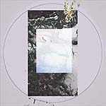
10/29 Palimpsest, acrylic and canvas over leaf on canvas, 36 x 48 in.
I was using the 1885-87 M. Ste. Victoire painting as a model. After a while, I thought "this is going badly, it's going to take forever to get it to look like Cezanne's." So, I stopped doing that, and just started painting. My brush "fell" very closely to where Cezanne's did, because when it looked finished to me, it looked very much like his, except for the "modernisizing" of the palette! This is giving me something to think about. Somewhat like the time early in my computer art, when I wrote a program to make random lines and colors, the result looking very much like Pollock. Says much about pre- and post- conceptualizations of the visual, that I will have to continue to dig out.
Anyhow, I like the piece for it's matrix of palimsests. In. Across. Mental. Emotional. The next one was begun before this was finished. Will see if things continue to develop, or if it is a dead end.
11/8
After reaching the spot of "Palimpsest," I didn't see which way to go. The new piece I had started sat on the easel. I framed pieces for the show I have to hang Saturday. Then, lying in bed last night, I saw the way. Today in the studio, as I finished the framing/matting, I looked again at "Palimpsest" and the barely-started canvas next to it, and I think I can move forward. A little fearful that it might work out, a little excited that a new richness might develop.
11/15
I showed Tim, a painter I'm mentoring, how to discover inspiration for his next piece from the one just finished. After he'd left, I realized that the scenario I'd set up for him, worked for me, too. A rectangular, vibratingly defined door-like shape from his painting was so in my head that I had to put it down on the canvas I have been working on, before I left the studio. This could be a step back, and a trite one at that, if I'm not careful. Even later I realized that there was a door-like shape in the most recently done "Palimpsest." As it stands, it's 60-40 the idea will flop; but there is a chance that the tensions in working with it will create something new and vital.
Saw a pattern in the light behind the trees up the hill. I think I'll use it in the current work, which is being attracted into the "Palimpsest" style orbit. I don't know what else will go into the painting, but it is becoming an attractor, too. Meanwhile I have an opening tonight. Maybe this one will be more than just okay, just ephemeral.

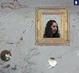
Back from vacation. Rocks gave me idea for new composition, so I drew them. Jane found a beach thing I'm using it in a computer print I've started, Emerson's Nature.
12/20
Three of my "Palimpsest"-type works were rejected from a regional exhibit. In his own work, the juror uses nice color, but no composition, paints Goofy as representing his "impotent masculinity," and talks postmodernist concerns about himself and society. I hope he just missed my work.
I've added three small areas, scrubbed them, and tacked on a studio scrap to the newest "Palimpsest" painting. I like the pace. The composition is getting safe, though, so I'll look harder at the rocks drawing (12/13).
12/31/2006
![]()

![]()
![]()
![]()
![]()
![]()
![]() Previous
Previous ![]() Top Next
Top Next![]()
pencil on paper, 9 x 12 in
archival computer print
12 x 12 in
acrylic & ink on canvas
24 x 30 in
acrylic on paper and canvas
24 x 24 in
computer, 12.5 x 15.5 in.
archival computer print
14x14 in.
acrylic
36x48 in.
pencil, 12x9 in.
computer, 12.5 x 15 in.
oil on canvasboard, 14 x 10 in.
oil on board, 10 x 14 in.
acrylic, 48x36 in.
_web_sm.jpg)
(detail of finished painting)
computer, 12 x 15 in.
acrylic, ink, canvas on paper, 10 x 8 in.
acrylic, pencil, collage on paper, 8 x 10 in.
computer, 12 x 15 in.
computer, 12 x 15 in.
acrylic & canvas on canvas, 36 x 48 in.
computer, 12 x 15 in.